Background
Lonely Floater is a lifestyle clothing brand. As Lonely Floater grew as a company beyond clothing, we needed to rethink the user experience on how customers interact with the brand and website.
My Role
Product Designer and UX Researcher
Goal
Redesign the landing page experience and website architecture to support higher conversion rates and reducing the bounce rate on landing page and sub pages.
Impact
A revamped website with a consistent design and information hierarchy that makes the process of navigating the website and purchasing products clear. Participants in user research sessions expressed that the redesign was straight forward and gave website a clear brand voice and easier to shop collection items.
The Problem
The company website was experiencing a high bounce rate on landing page and sub pages. Customers weren't navigating beyond the landing page or interacting with components on other sub pages.
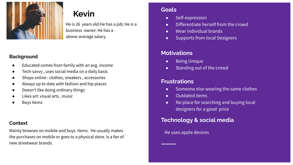
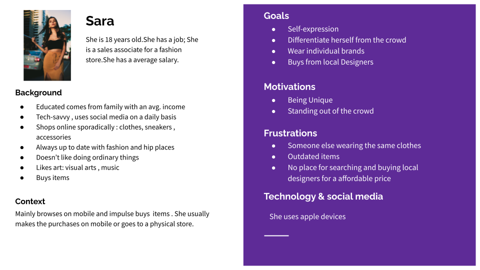
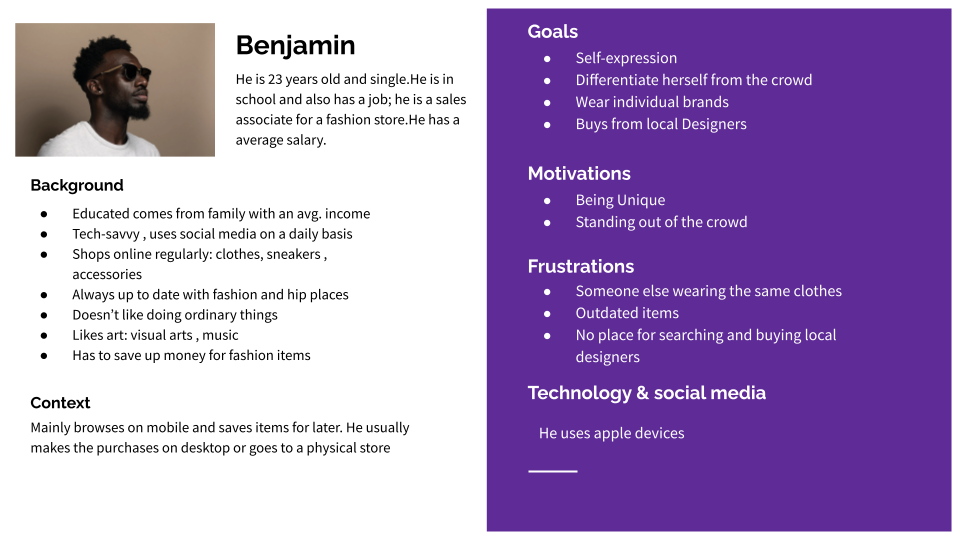
Personas
Personas were created using data collected from website analytics. Personas were used to narrow down the user goals and drive deeper context to each type of user's motivation.
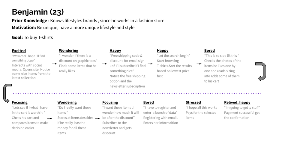
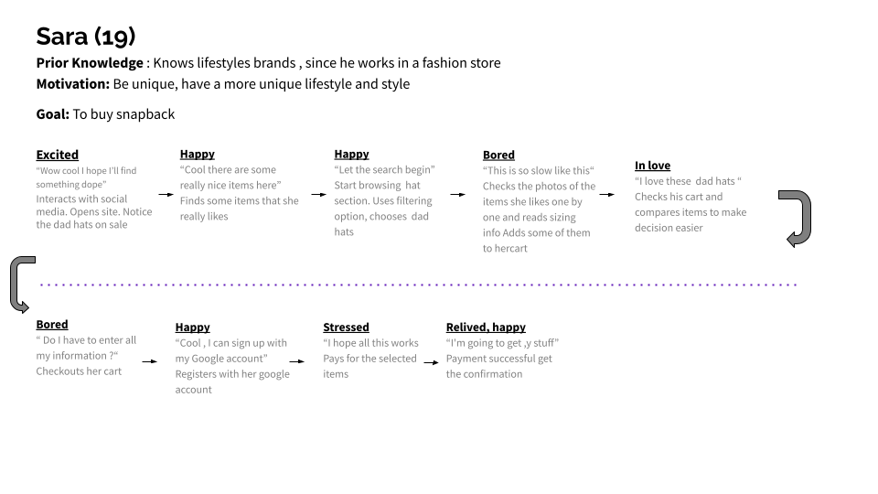
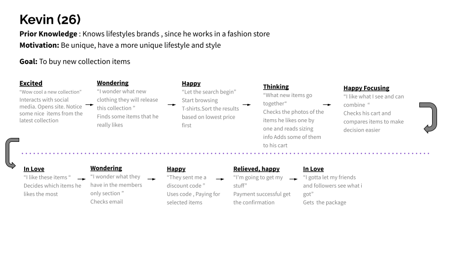
Customer Journey Mapping
Research
We conduct user research. We interviewed 6 people that fit our researched personas. Three participants had no knowledge of Lonely Floater website and three participant were familiar with the previous website. The main questions we wanted to answer:
How do you feel about the our home page content?
How did you feel scrolling down the landing page?
What are your main goals when visiting this website?
What was your overall mood after leaving this website?
Key Research Takeaways
We identified patterns and themes from our results, several issues with the design:
1. Participants didn't click through-out the website. People didn't care for the impulse items on landing page
2. Participants also didn't understand the music function of the website.
3. Participants expressed uncertainty with finding specific items beyond the landing page.
4. Participants who weren't familiar with the brand or website expressed they didn't feel motivated to return to website.
Areas pointed out by Participants
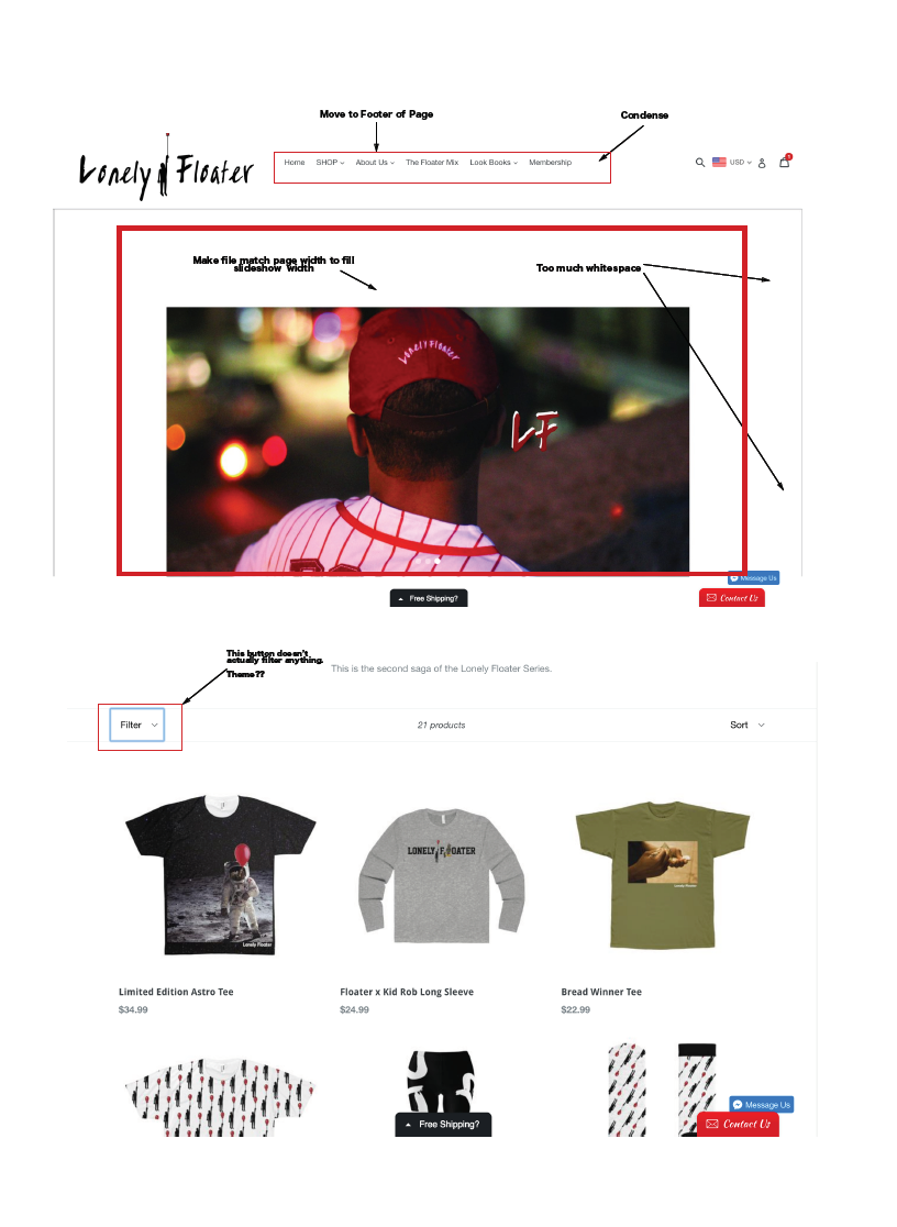
Overall, 60% of the participants said the website didn't grab their attention and some pages didn't feel connected to the overall experience. After identifying these issues, I designed wireframes , then proceeded to created high-fidelity visual designs.
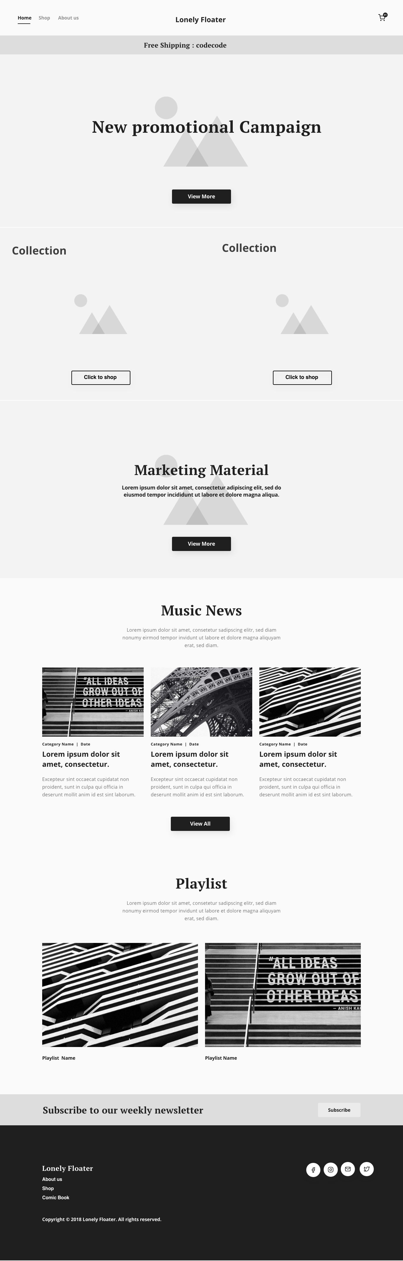
Wireframes & IA( information Architecture )
The next step was creating high-fidelity wireframes that helped present the information thoughtfully and clearly by sectioning the information. This established a framework to meet the user requirements and focus on information hierarchy and content strategy.
Eventually , the marketing team decided on a design that was highly visual and provided touch points for potential customers to experience the website in a digestible way. We did not want to create a website that risked cognitive overload, we wanted users to able to digest the content and have a frictionless shopping/discovery process.
Constraints
There were technical and visual constraints along the way because the website was supported by Shopify's platform. To remedy this there were modification applied to some components in the wireframes to match the requirements for their platform. Some of the front-coding was beyond the scope of this project timeline. As a result , we had to work with Shopify's developers to achieve our MVP within the timeline.
Validating designs
A final round of in person interviews with 6 people was conducted to validate the new design. Participants were asked to navigate the website and explain how they felt at different points of discovery on the Lonely Floater website. We also conducted a CTA A/B test that showed a 60% increase from landing to featured collections and more positive responses from participants. The new participant were also asked about their expectations for lifestyle brand websites compared to other websites to improve the websites user experience for the future.
Changes made to the design based on the results of the A/B test:
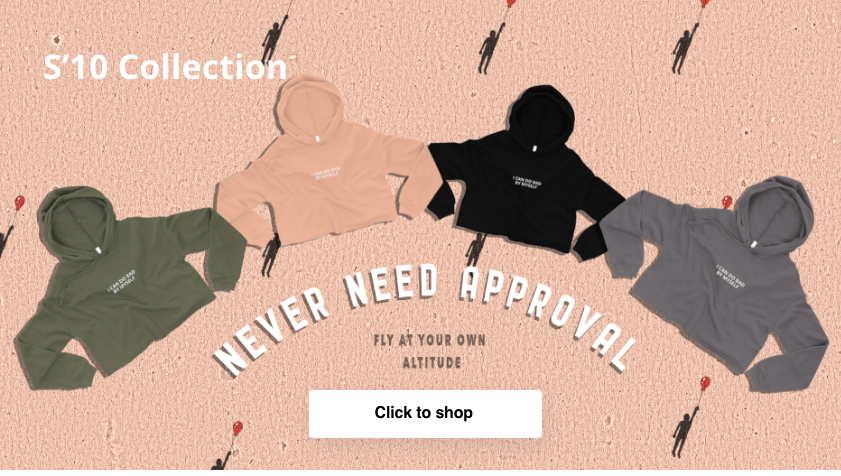
-Adding clear instructions on how to navigate website like CTA's saying "shop" would be "Click Here to Shop"
-Prioritizing information in a top down structure allowing business goals to match consumer needs. By placing important campaigns and sales promotion at the top of the landing page.
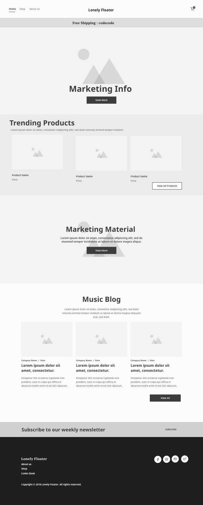
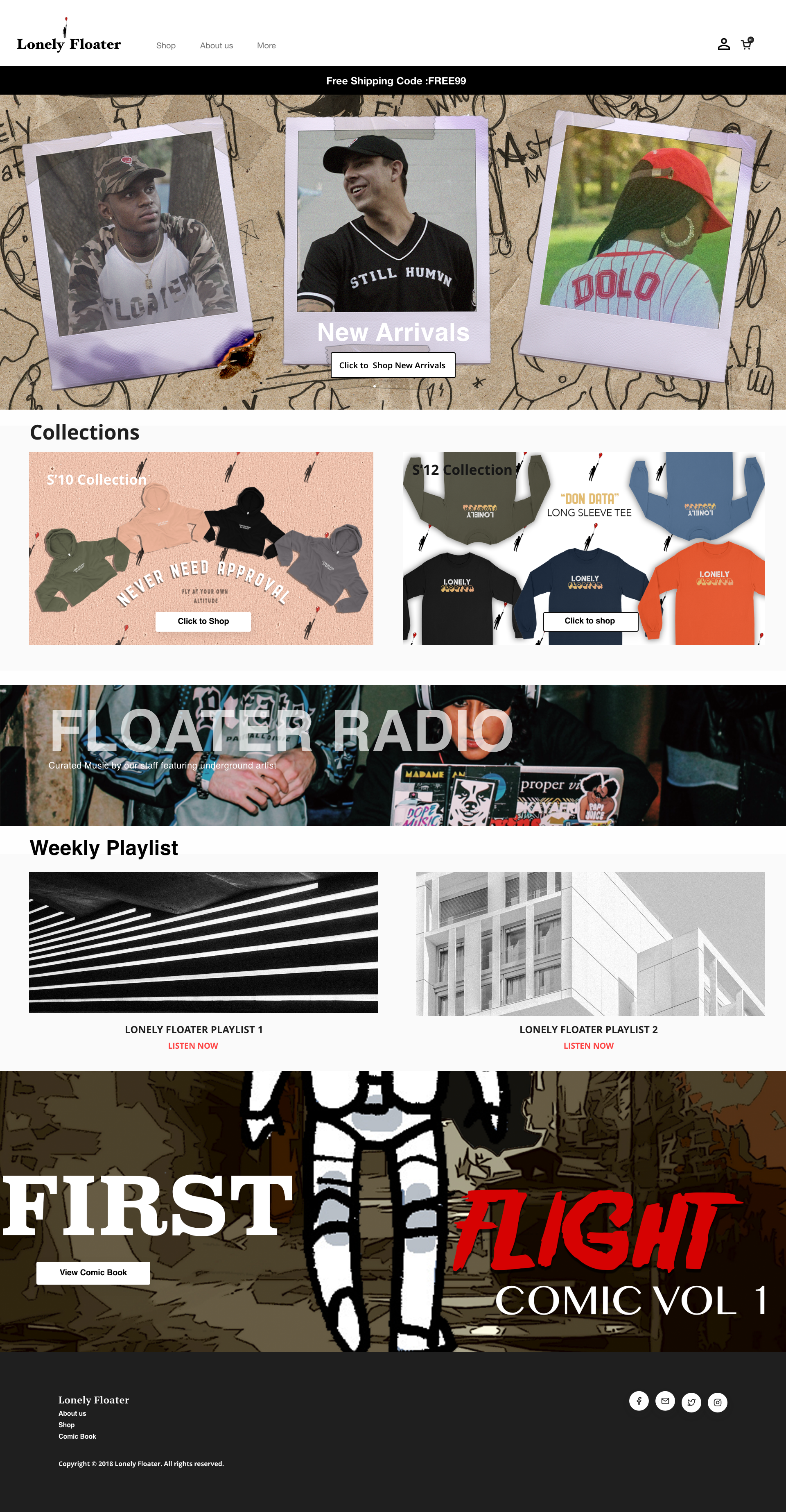
Final Website
Final Takeaways
Participants were able to navigate through various point and commented on the websites being straight forward. They expressed that the products being sold were great and several mentioned wanting to purchase products and sharing the company on social media.